MAKEOVER: Goodbye, Columns
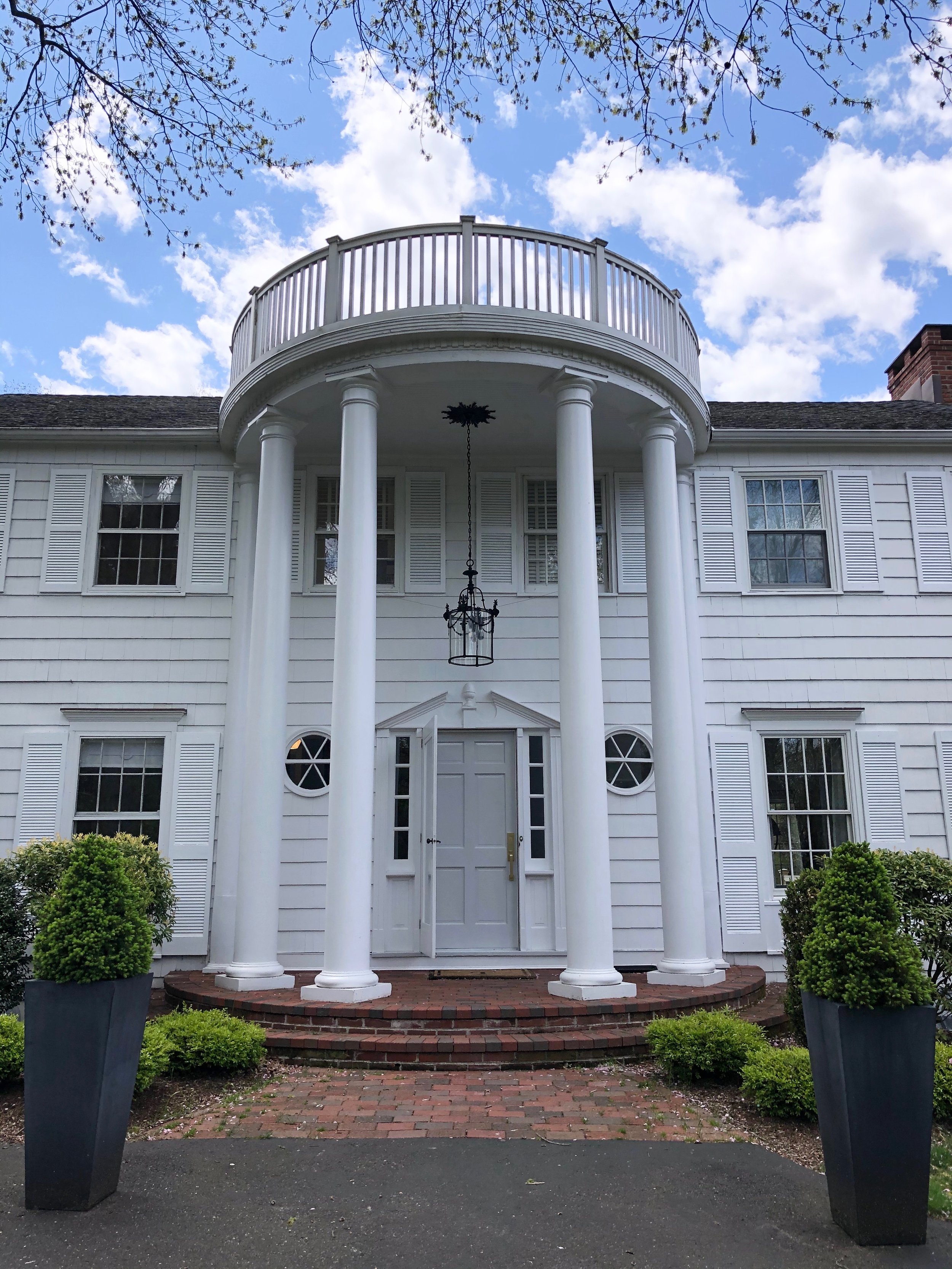
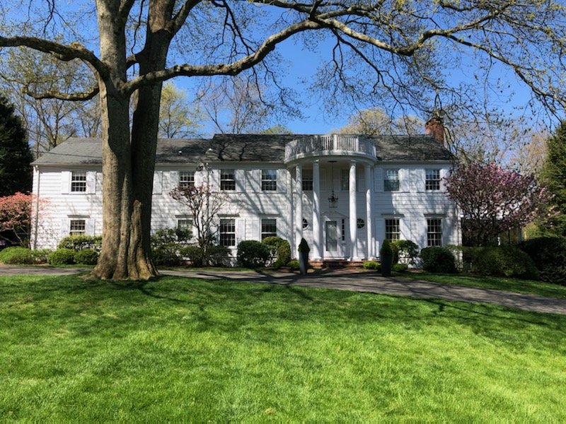
When you want a facade that feels like a nice, white, house and not “The White House,” it might be time to ditch the columns. Here’s are some design details from architect Jessica Talley, principal of Spring Architecture + Design who recently renovating the facade of her Connecticut colonial.
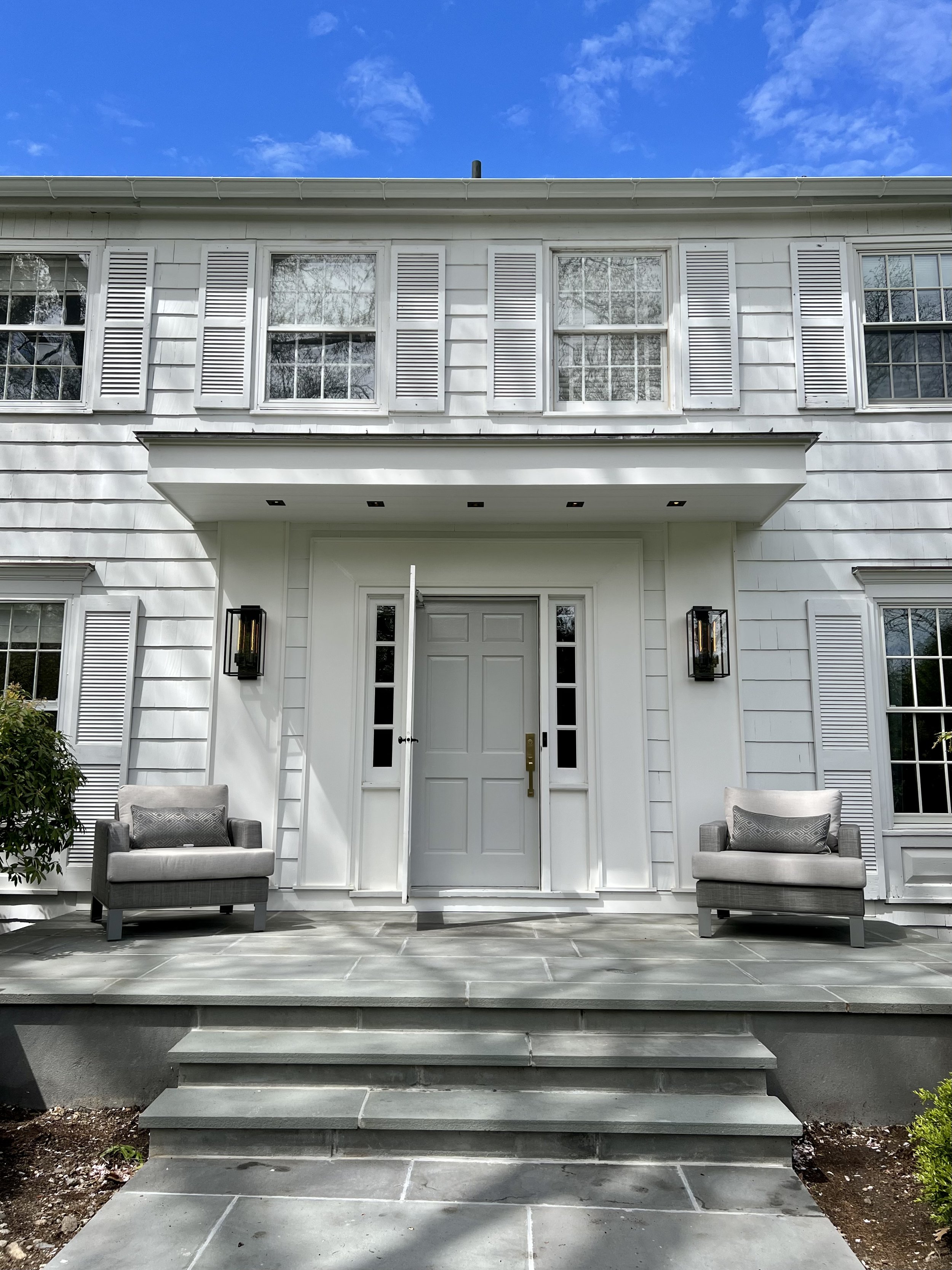
The Front Stoop: Existing half-circle was widened to create a rectangle. The larger ground space and the absence of columns allows for a little outdoor “living room.”
Overhang: The cantilevered overhang (hung from the floor beam) and trim details modernize the entry. Talley chose to remove the dated circular windows.
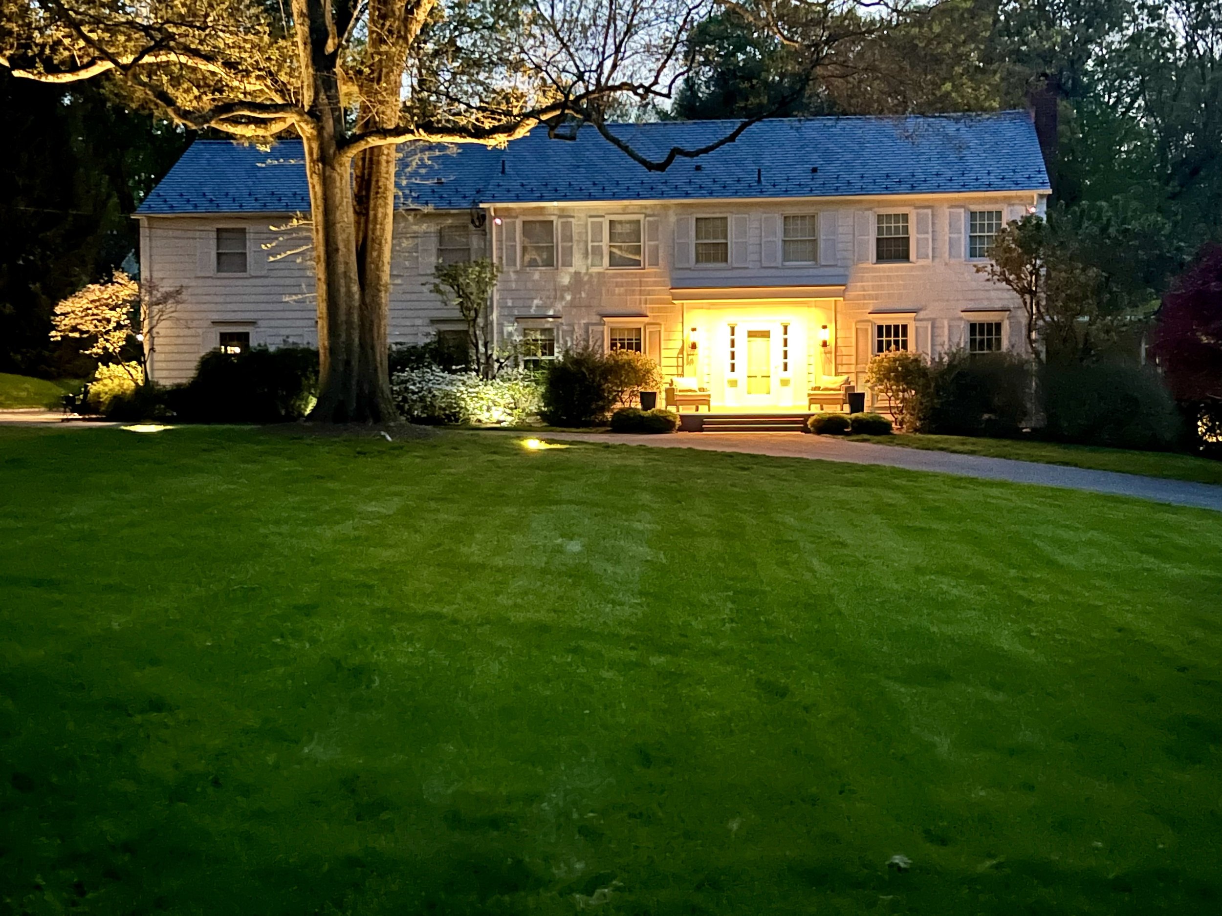
Lights: The sconces are Restoration Hardware. The overhang houses recessed dimmable lights for late-night hang-outs, and to illuminate the whole facade.
The Gutters/Leaders: Replaced with more modern, larger, half-round gutters in white metal.
Paint: BM Super White on the shutters and BM Chantilly Lace on the siding and trim. Talley wanted a “gem” of a door, so she used the Fine Paints of Europe Hollandlac which is a beautiful glossy paint. The color is Winter Sky, a subtle light grey.
Roof: As with all of Talley’s projects, sustainability was key. The roof is made of 100% recyclable synthetic slate which is one of the “greenest” roofing materials on the market. Scraps can even be returned for recycling.
Thank you for all the useful insights Jessica! Do you have a makeover to share? Email it to us at hello@mydesignport.com!


