Kitchen Fix: With Diane Rath
This kitchen renovation recently completed by The Rath Project is one of the best kitchen transformations we’ve seen! Watch the 3 minute video to see the before and after, hear why Rath chose the finishes she did, and the fun surprises they added along the way, including a bonus feature for the pup. Read on for more information about the renovation and sources.
The home is a mid-century style expanded ranch in Westport, CT. The homeowner is licensed acupuncturist Iris Greenfield from the Noa Center, and she’s been craftily modernizing the home one room at a time. She says she loves “color, pattern and a touch of whimsy” and she found the perfect designer in Rath. Rath is one of those designers whose projects make you smile: she embraces color and infuses her spaces with happy energy and mid-century modern vibes, while maintaining clean lines and timeless style.
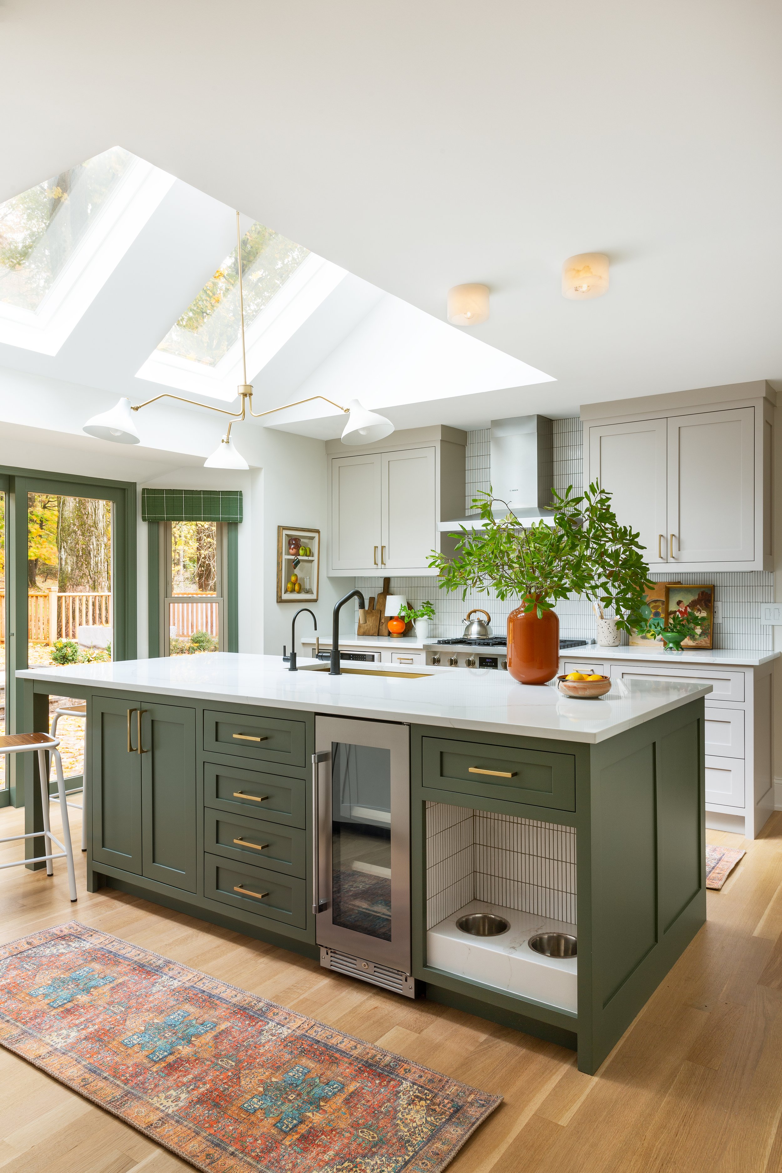
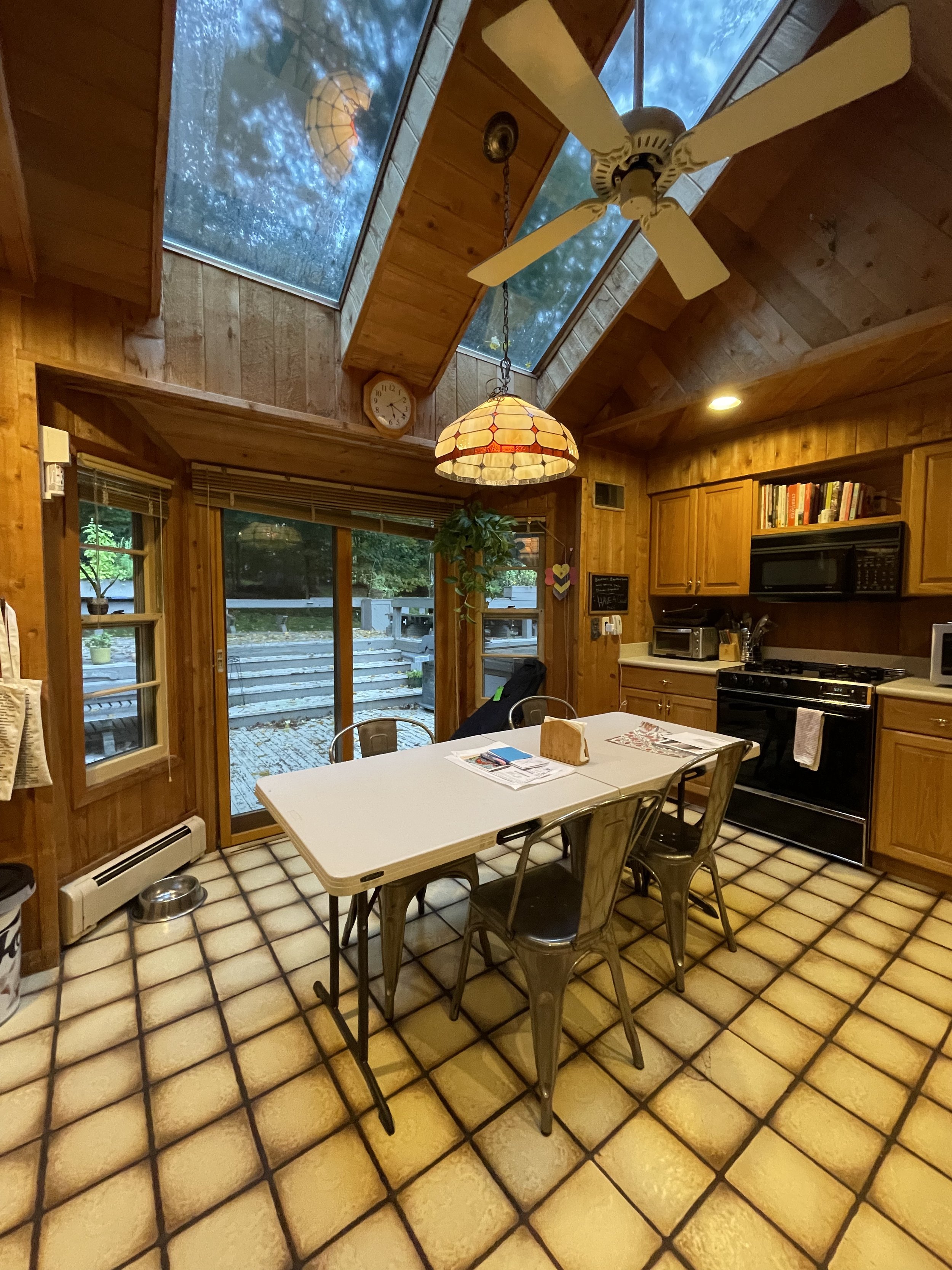
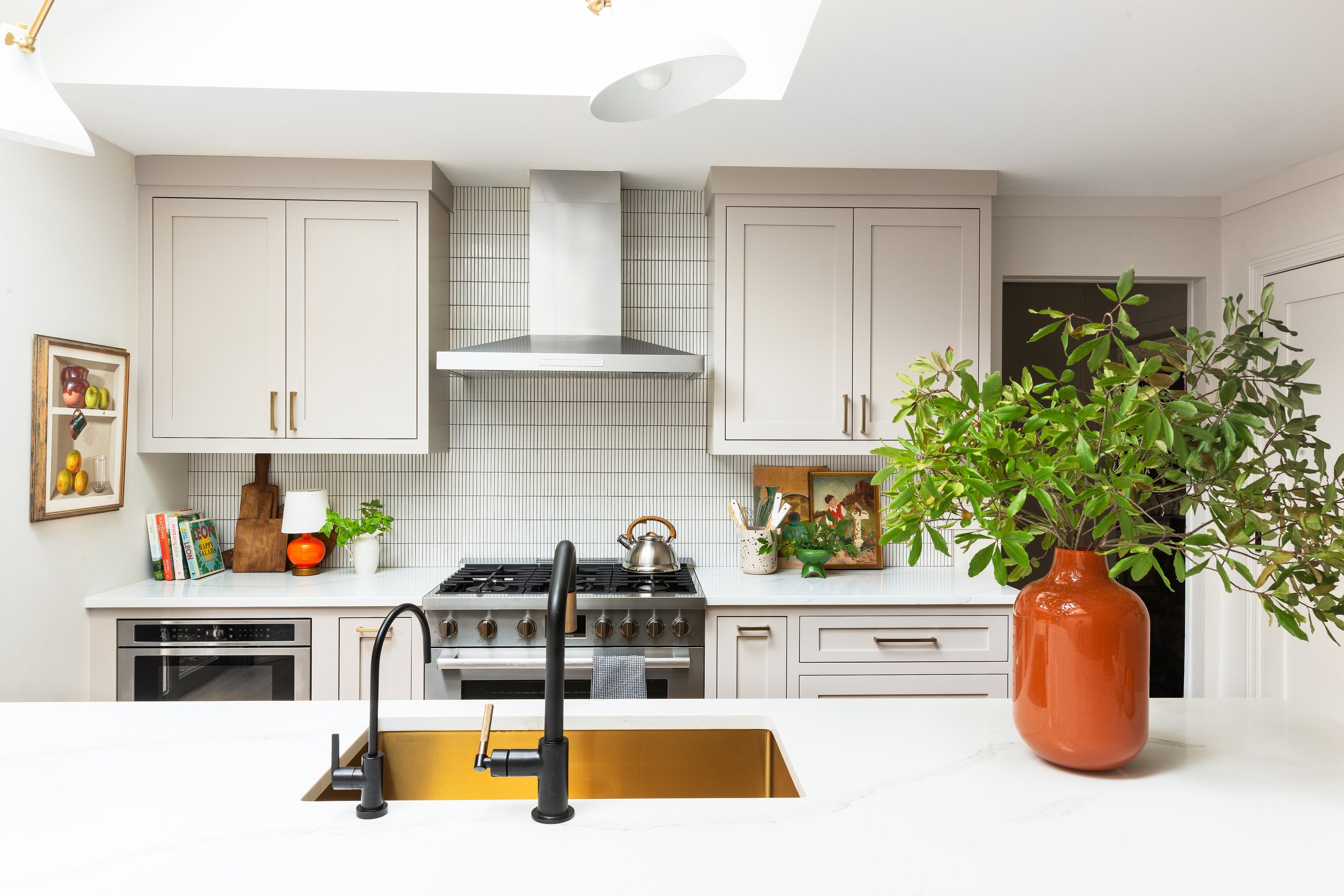
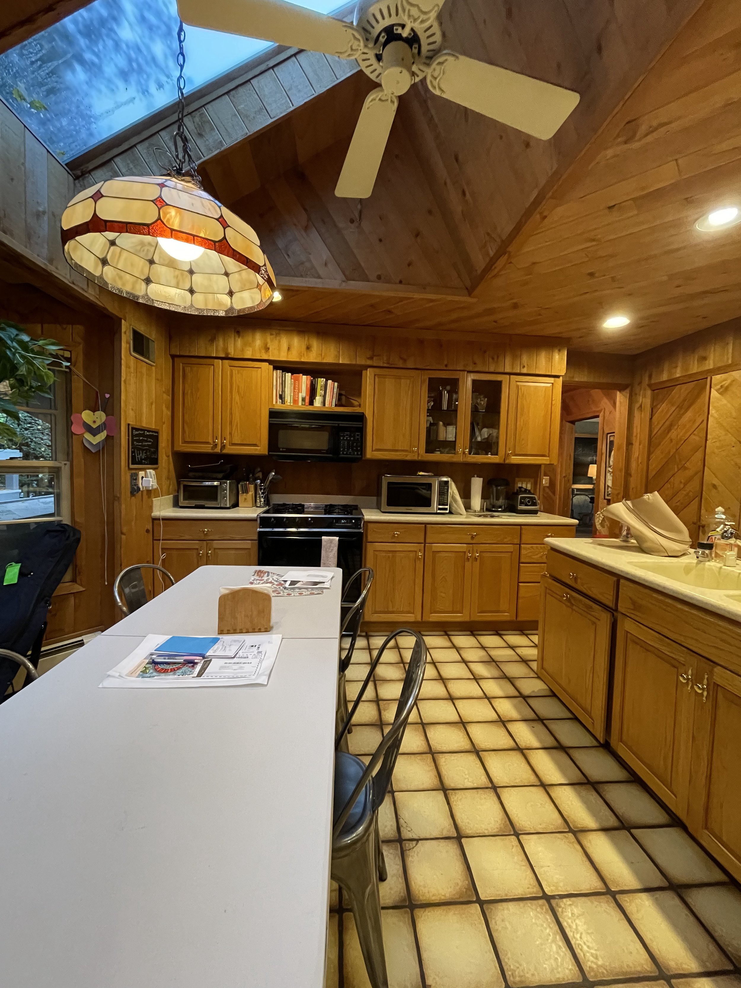
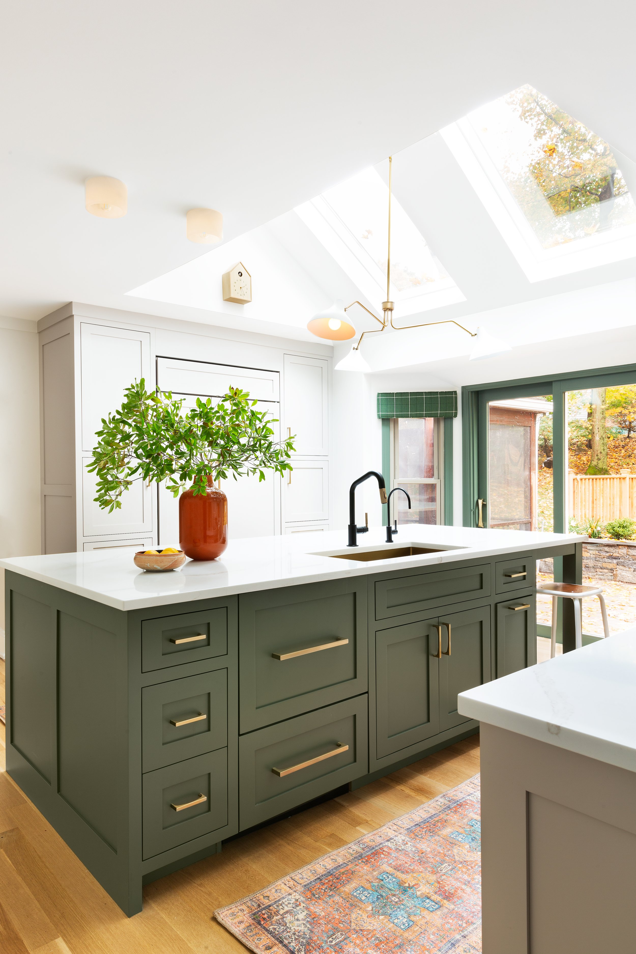
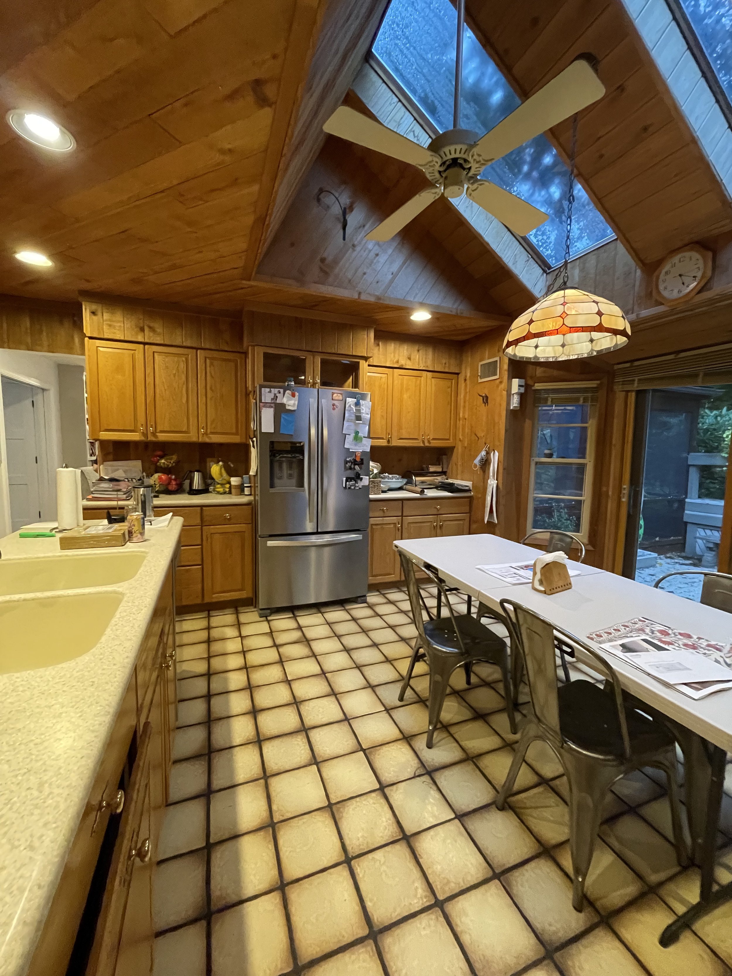
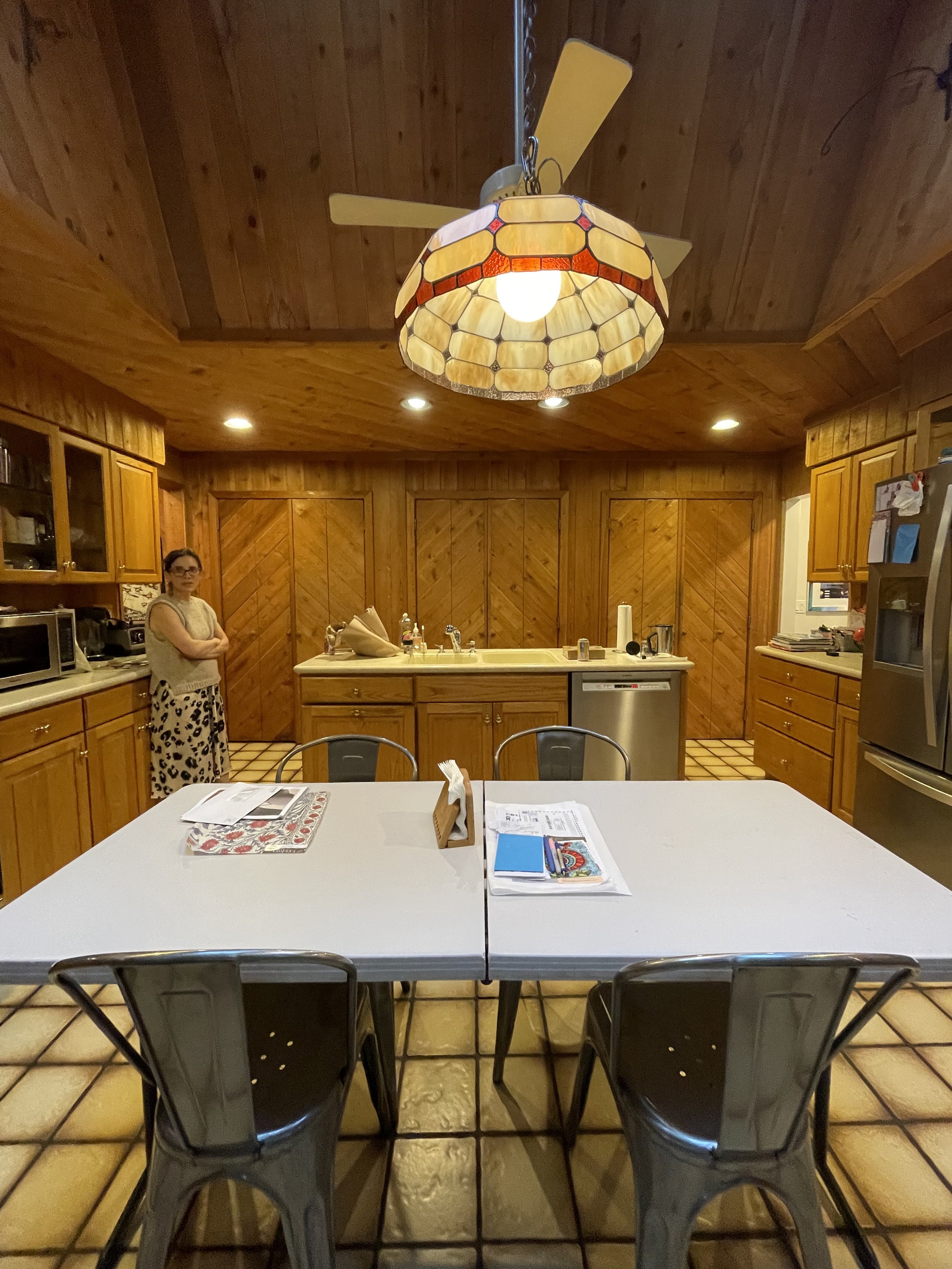
Without changing the footprint, they reconfigured the awkward kitchen space into a bright and functional heart for the home. A small inconveniently placed island was removed and a large central island was installed with built-in countertop seating.
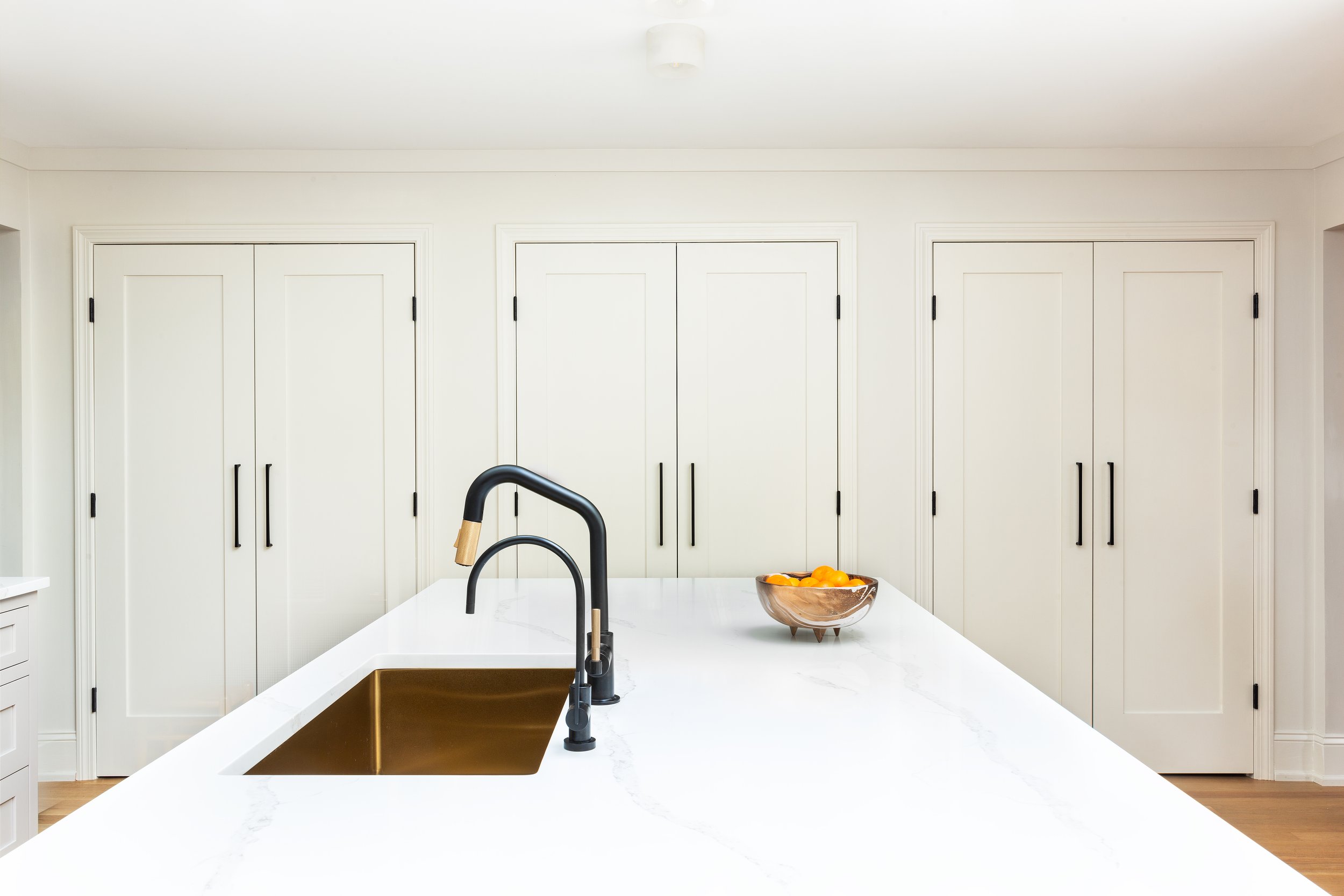
For color, they created a neutral backdrop with taupe-y mushroom cabinets, softer than a white but still neutral. Then for some fun, Rath chose a eucalyptus green on the island, which she says “brings the outdoors in.” A linear backsplash increases the modern feel, and the darker grout plays off the colors in the cabinets. The countertops are sparkling in Quartz.
They chose brass hardware and swapped it for black on the pantry doors to tie in with the rest of the home’s hardware. A fun surprise awaits in the pantry: the shelves are painted to match the island and a plaid wallpaper creates a fun background. The wallpaper is vinyl, making it extra durable. Then, in a stroke of design genius, they took the same pattern and transitioned it to the other side of the kitchen by flipping the colorway and using a fabric by the same maker for the cornices.
Don’t miss the final touch - the dog area in the island with the same backsplash as the feature wall. How cute is that?
Sure, the ridge took a year to come, but Greenfield says she is “obsessed” with her kitchen and it was worth the wait.
Resources, courtesy of The Rath Project:
➡ Wallpaper and valence fabric: Thibaut
➡ Cabinetry: Sharp Line Cabinetry @sharplinecabinetry
➡ Tile: The Mosaic Factory @mosaic.factory
➡ Plumbing Fixtures: Brizo
➡ Lighting: Hudson Valley Lighting & Rejuvenation
➡ Appliances: Aitoro Appliance www.aitoro.com
➡ Construction: Chris Bargas http://www.bargasdevelopment.com/
Have a makeover project to share? Please email us information and images at hello@mydesignport.com
Photo Credit: Erin Kestenbaum

